
The graph below depicts the earnings of A and B over the period 2000 to 2010:
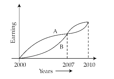
From the graph, which one of the following can be concluded?
Correct Answer :
On the average A earned more than B during this period.
Solution :
Correct Answer/Option: "On the average A earned more than B during this period."
To determine who earned more on the average between A and B during the period 2000 to 2010, we can analyze the visual data represented by the curves in the graph:
1. Understanding Average Earning:
The average earning over a given period is defined as the total earnings divided by the total duration of the period:
Graphically, the total earnings correspond to the area under the earning curve for each individual. Therefore, the individual with the larger area under their curve over the entire period [2000, 2010] has the higher average earning.
2. Analyzing the Graph by Intervals:
The curves intersect at the year 2007. We can divide the graph into two distinct intervals based on this intersection:
* First Interval (2000 to 2007): This period spans 7 years. During this time, the curve representing A is consistently higher than the curve representing B. This shows that A's earnings were significantly higher than B's earnings for the majority of the decade.
* Second Interval (2007 to 2010): This period spans only 3 years. During this time, the curve representing B is higher than the curve representing A, meaning B earned more than A in these final years.
3. Comparing the Total Earnings (Area Under the Curves):
* The period during which A earned more than B (7 years) is more than double the period during which B earned more than A (3 years).
* Visually, the vertical gap between curve A and curve B during the first 7 years is quite large, resulting in a much larger area accumulated by A compared to B.
* The smaller lead that B has over A in the final 3 years is not enough to offset the massive lead A accumulated over the first 7 years.
* As a result, the total area under curve A over the entire period from 2000 to 2010 is clearly larger than the total area under curve B.
Since A has a larger total earning over the same 10-year period, A's average earning must be greater than B's. Thus, we can conclude that on the average A earned more than B during this period.
Access expert-curated educational resources and study materials—completely free.
Create, conduct, and manage professional online assessments with Mindyard. Perfect for teachers and institutes.
Copyright © 2026 Mindyard. All Rights Reserved.