
Average hourly earnings per year (E) of the workers in a firm are represented in figures A and B as follows:
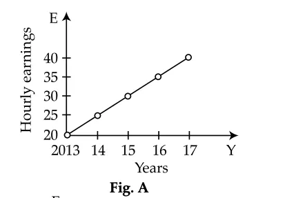
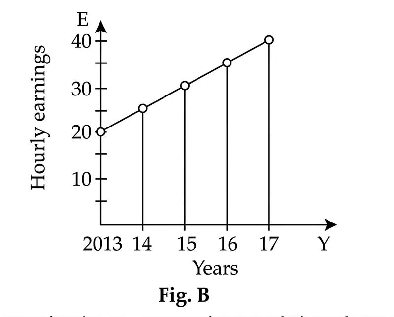
From the figures, it is observed that the
Correct Answer :
Slopes of the graphs are same
Solution :
The correct option is: Slopes of the graphs are same.
By carefully analyzing Fig. A and Fig. B, we can observe and extract the following data points for the years () and hourly earnings ():
For Fig. A:
- In the year 2013,
- In the year 2014,
- In the year 2015,
- In the year 2016,
- In the year 2017,
For Fig. B:
- In the year 2013, the line starts at
- In the year 2014, the point lies midway between 20 and 30, meaning
- In the year 2015,
- In the year 2016, the point lies midway between 30 and 40, meaning
- In the year 2017,
Let us evaluate each of the given options based on these details:
1. Values of E:
The values of at each corresponding year are identical in both figures (ranging from 20 to 40). Hence, the values of are the same, not different.
2. Ranges of E:
The range is defined as the difference between the maximum and minimum values:
Since this range is in both cases, the ranges of are the same.
3. Slopes of the graphs:
The mathematical slope of a linear graph represents the rate of increase of per year:
Since both graphs model the same data points, the mathematical slope (rate of increase) is exactly the same, which is dollars per year.
Note: The visual difference in the steepness of the lines is due to the different vertical scales used. Fig. A has a vertical axis starting at 20, which compresses the height and makes the rise look steeper. Fig. B has a vertical axis starting at 0, making the rise look gentler. However, mathematically, their actual slopes are identical.
Access expert-curated educational resources and study materials—completely free.
Create, conduct, and manage professional online assessments with Mindyard. Perfect for teachers and institutes.
Copyright © 2026 Mindyard. All Rights Reserved.