
Consider the following graph in which the birth rate and death rate of a country are given, and answer the two items (63-64) that follow.
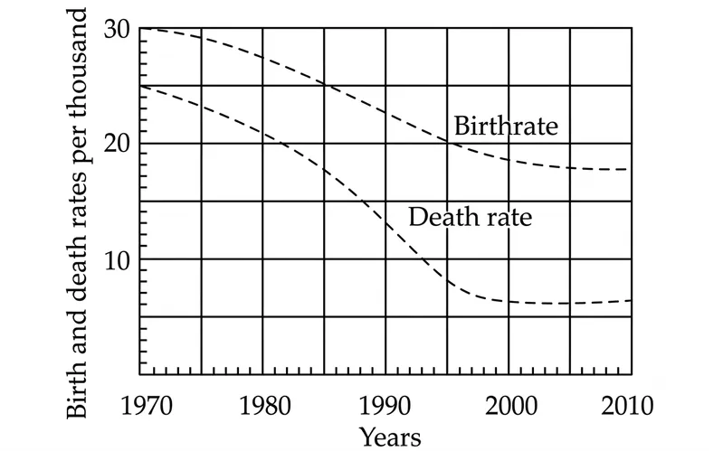
Looking at the graph, it can be inferred that from 1990 to 2010
Correct Answer :
population growth rate shows no trend
Solution :
Correct Answer: population growth rate shows no trend
Step-by-step Explanation:
1. Understanding the Relationship:
The population growth rate of a country is determined by the difference between its birth rate and its death rate. This relationship can be expressed as:
Graphically, this growth rate is represented by the vertical gap (distance) between the Birthrate curve (the upper dashed line) and the Death rate curve (the lower dashed line).
2. Analyzing the Data Points from the Graph (1990 to 2010):
Let us estimate the birth rate and death rate values (per thousand) from the graph at key intervals between 1990 and 2010:
Year 1990:
• Birth rate ≈ 25 per thousand
• Death rate ≈ 14 per thousand
• Difference (Growth rate):
Year 2000:
• Birth rate ≈ 19 per thousand
• Death rate ≈ 7 per thousand
• Difference (Growth rate):
Year 2010:
• Birth rate ≈ 18 per thousand
• Death rate ≈ 7 per thousand
• Difference (Growth rate):
3. Conclusion:
Between 1990 and 2010, both the birth rate and the death rate decreased significantly. However, because they fell at similar rates during this period, the difference between them (the growth rate) fluctuated minimally between 11 and 12 per thousand. Since the growth rate did not show a consistent upward or downward direction, we can infer that the population growth rate shows no trend during this period.
Access expert-curated educational resources and study materials—completely free.
Create, conduct, and manage professional online assessments with Mindyard. Perfect for teachers and institutes.
Copyright © 2026 Mindyard. All Rights Reserved.