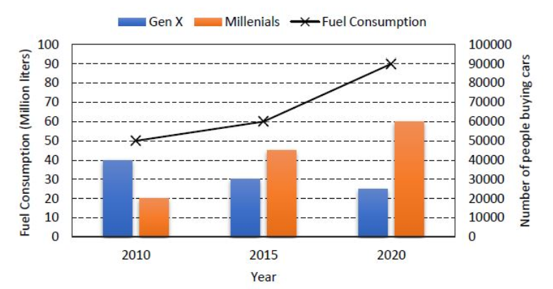
The chart below shows the data of the number of cars bought by Millennials and Gen C people in a country from the year 2010 to 2020 as well as the yearly fuel consumption of the country (in Million liters).
Considering the data presented in the chart, which one of the following options is true?
Correct Answer :
The increase in the number of Millennial car buyers from 2010 to 2015 is more than the decrease in the number of Gen X car buyers from 2010 to 2015.
Solution :
Correct Answer:
The correct statement is: "The increase in the number of Millennial car buyers from 2010 to 2015 is more than the decrease in the number of Gen X car buyers from 2010 to 2015."
Step-by-Step Explanation:
1. Extracting the Data from the Chart:
By carefully analyzing the columns and axes in the chart:
2. Calculating the Changes from 2010 to 2015:
Let's calculate the increase in Millennial car buyers from 2010 to 2015:
Next, let's calculate the decrease in Gen X car buyers from 2010 to 2015:
3. Verification of the Correct Option:
Comparing the two values:
Since 25,000 is greater than 10,000, the statement that the increase in the number of Millennial car buyers from 2010 to 2015 is more than the decrease in the number of Gen X car buyers from 2010 to 2015 is true.
Access expert-curated educational resources and study materials—completely free.
Create, conduct, and manage professional online assessments with Mindyard. Perfect for teachers and institutes.
Copyright © 2026 Mindyard. All Rights Reserved.